Alistair Crighton

Alistair Crighton, a long time friend and highly esteemed sign writer who has just completed the lettering on the Stewart Christie store front takes some time to talk to us about his career in and love of sign writing.
How did your love for your craft begin?
After leaving Art college, one of my first jobs was working as a screen printer where there was an old time - served songwriter whose lettering skills I envied and began to practice towards.
How long has it taken you to perfect your craft?
Now over 42 years since I started working for myself, the whole hand lettering skills thing is, like any skill, about repetition and improvement which comes in my opinion through observation then application.
Do you believe there is such a thing as perfection in the artistic world?
Perfection? Who can judge that? “ One does ones best” and leaves it to the client/viewer, but the art world is notoriously chameleon -like in its tastes and values reflecting as it does our society.
What is the most enjoyable element of what you do?
Satisfaction from a challenging job well done, also enjoy people commenting, usually favourably, when working “on the street” - one comment yet to hear in all these years “you’ve spelt it right!”
Do you have a local? A place you go in Edinburgh for a good dram? Or just as favourite place in town in general?
Dont have a local as such, a good dram when available is usually at home or a friends - reminds me of the old joke about the aged Highlander visiting his niece in Edinburgh, and when asked what he took in his whisky smiled and said “just more”.
Is Edinburgh missing something? And is there a place you’d rather be?
I enjoy Sunday morning services in Chalmers Church on Morningside Road - the old Morningside Parish Church which has the most magnificent stained glass windows dating from the late nineteenth century with Old and New Testament scenes created locally then by an Edinburgh firm, long since gone, including some tremendously inspiring hand lettered text work. Every aspect of how these windows were created reflects the best human qualities of hand - eye coordination.
Edinburgh is becoming too much of a tourist oriented stop - over town, I’ll say no more than I miss the more relaxed non-Fest periods of former times.
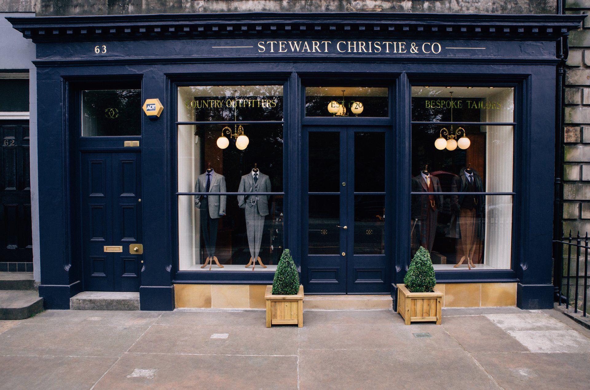
You’ve just completed the wording for Stewart Christie's new shop front. Are there any fonts or styles that you prefer?
When gilding letters, as with yourselves, I’ve come to believe that the classical letter styles cannot be beaten. When well executed, the Roman Capital is to me the unsurpassed epitome of style and elegance. It remains the standard by which lettering artists of quality are judged.
Have you created many of your own fonts?
I’ve done several, mainly Italic style fonts. Probably my most weel kent one would be the font I designed for the Pierre Victoire restaurant chain of fond memory. Originating in Victoria Street, Edinburgh, at its zenith there were approx 120 units before its spectacular collapse.

Many thanks to our good friend, Alistair for taking the time to share these words with us.
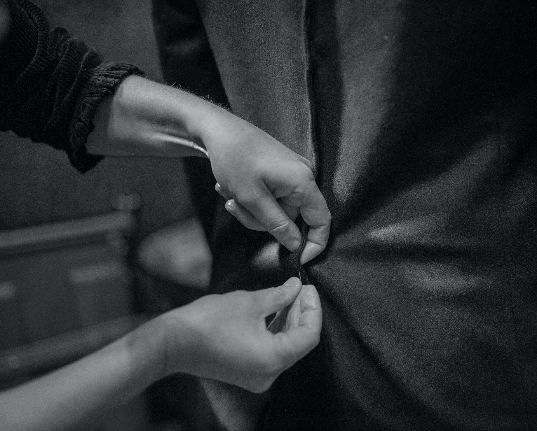
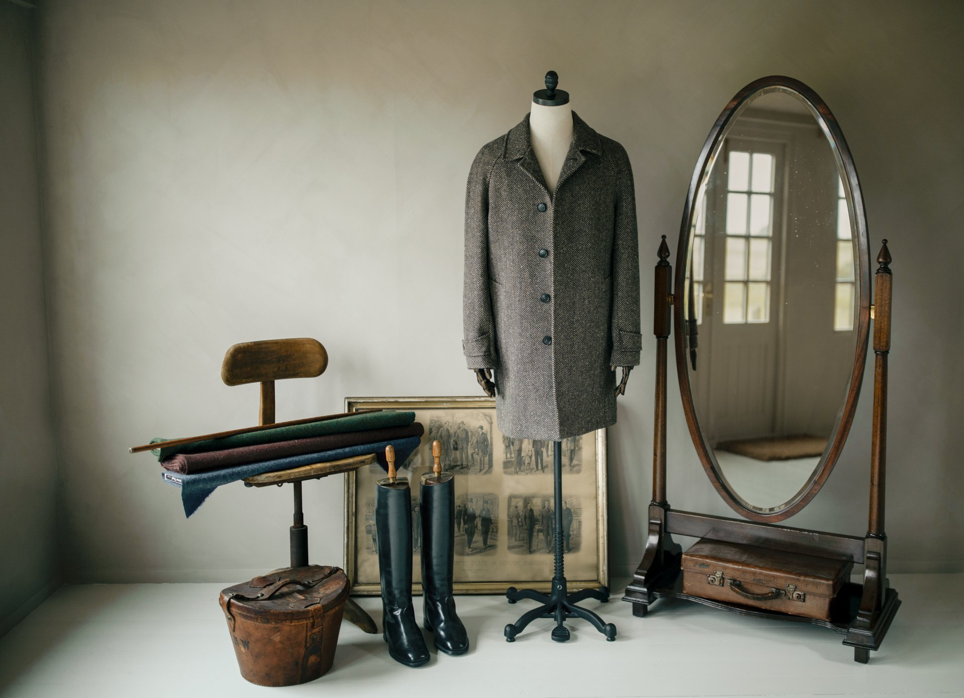
Tales of Tailoring